Luminomix
Logo concepts
Source Inspiration
“The main focus is we don’t like how the N and the O are smooshed. And we don’t like the line above the O because it actually makes the pronunciation incorrect. We like the pronunciation format and we like the shutter in the O.“
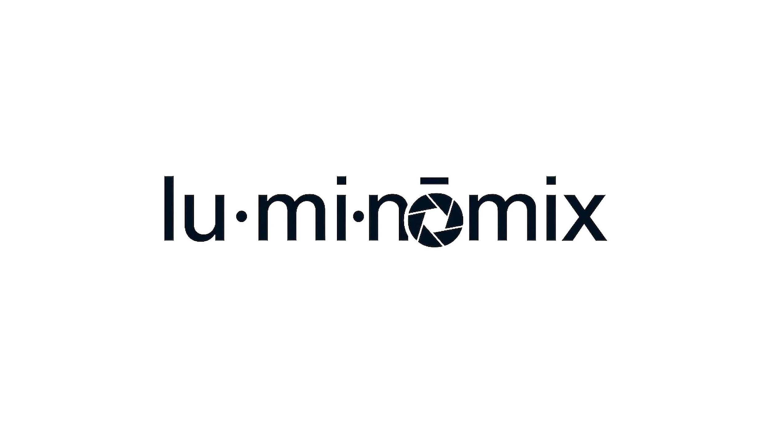
Concept 1
This first concept maintains all parameters, but chooses to relocate the aperture symbol into its own mark.
This is for two reasons.
The first is legibility. Shrinking such a complex symbol into the “o” is a challenge to maintain detail. Giving the symbol its own space lets the detail breathe a bit better.
It also allowed me to give some love to the symbol design itself. I researched hundreds of aperture symbols and they are all basically the same. With this extra space I was able to design from scratch a more stylized interpretation of what an aperture mechanism looks like, invoking smoother and more nuanced shapes. I dig the yin-yang suggestions.

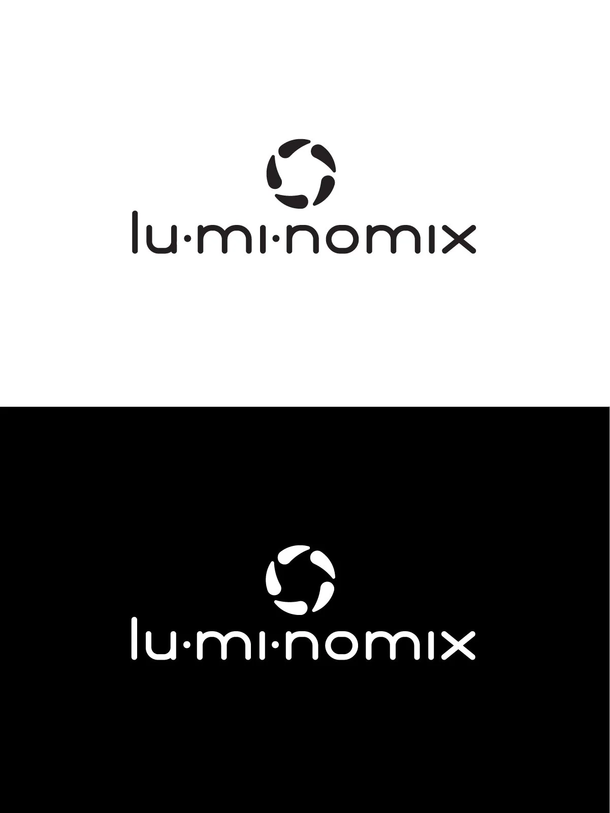
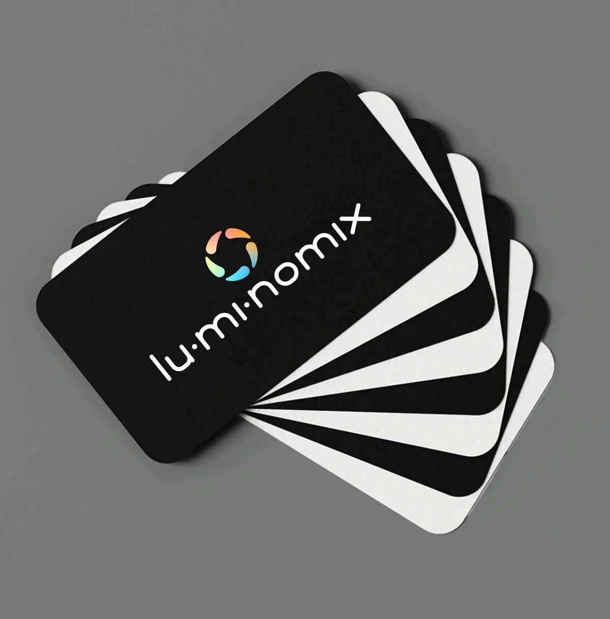
This second reason for moving the symbol outside the text is simply to create a brand mark. Having one is really useful across digital media (social media badges, avatars, etc).
A note about color: when a brand is strictly black and white, it opens up the possibility of using full spectrum highlights in a unique way. In other words, when a brand has no color, it can potentially have all colors.
Concept 2
This second concept puts the aperture back within the text. Although it removes the phonetic separates, it redistributes emphasis on clean legibility.
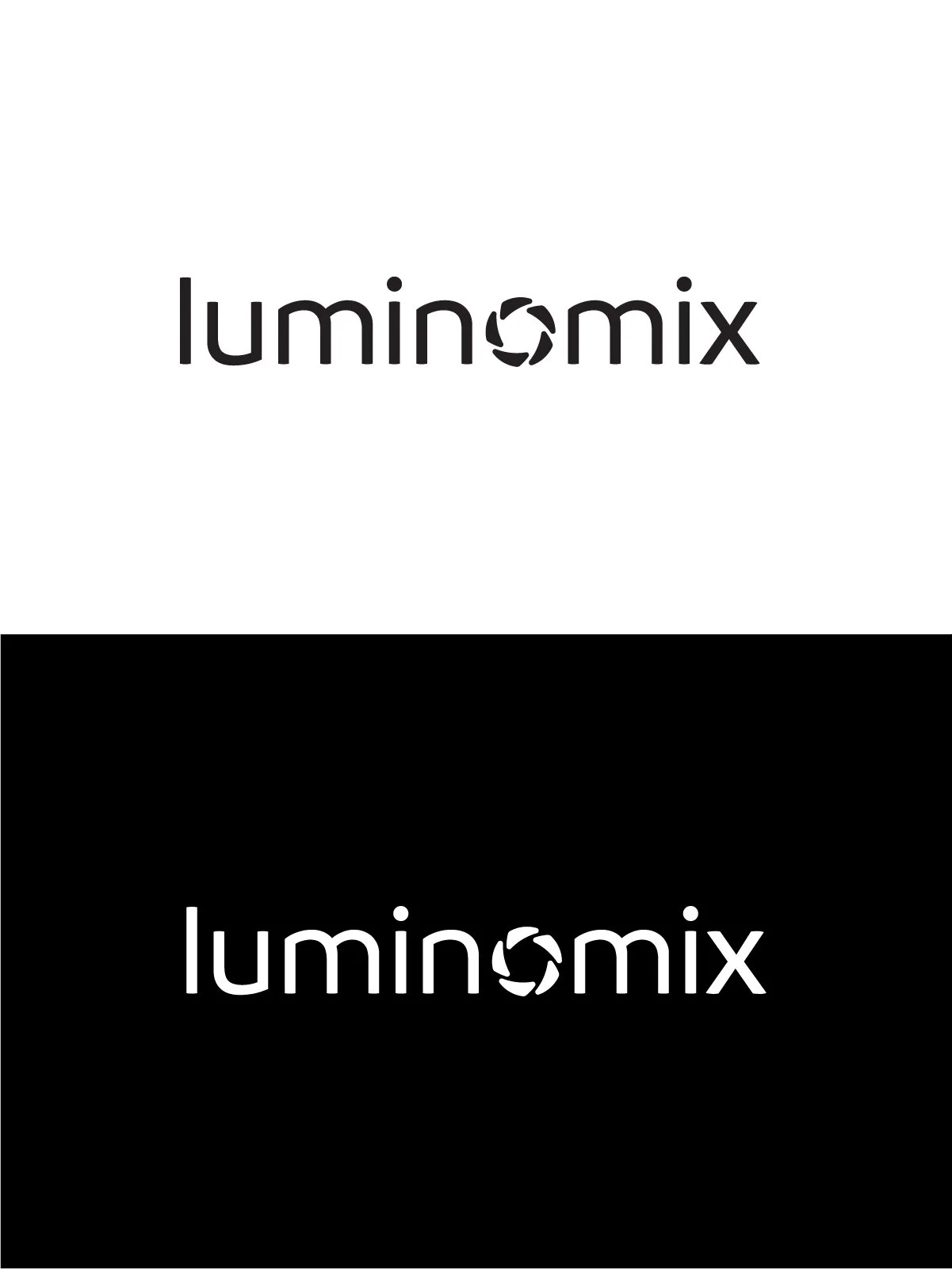
One of the ways it accomplishes this is through shape distillation: all letters are either straight lines, or a re-use of the same curve. This is subtle but it triggers something subconscious even if it’s not immediately clear why.

Concept 3
Sometimes I like to explore an option that goes against instruction, just to see what we see.
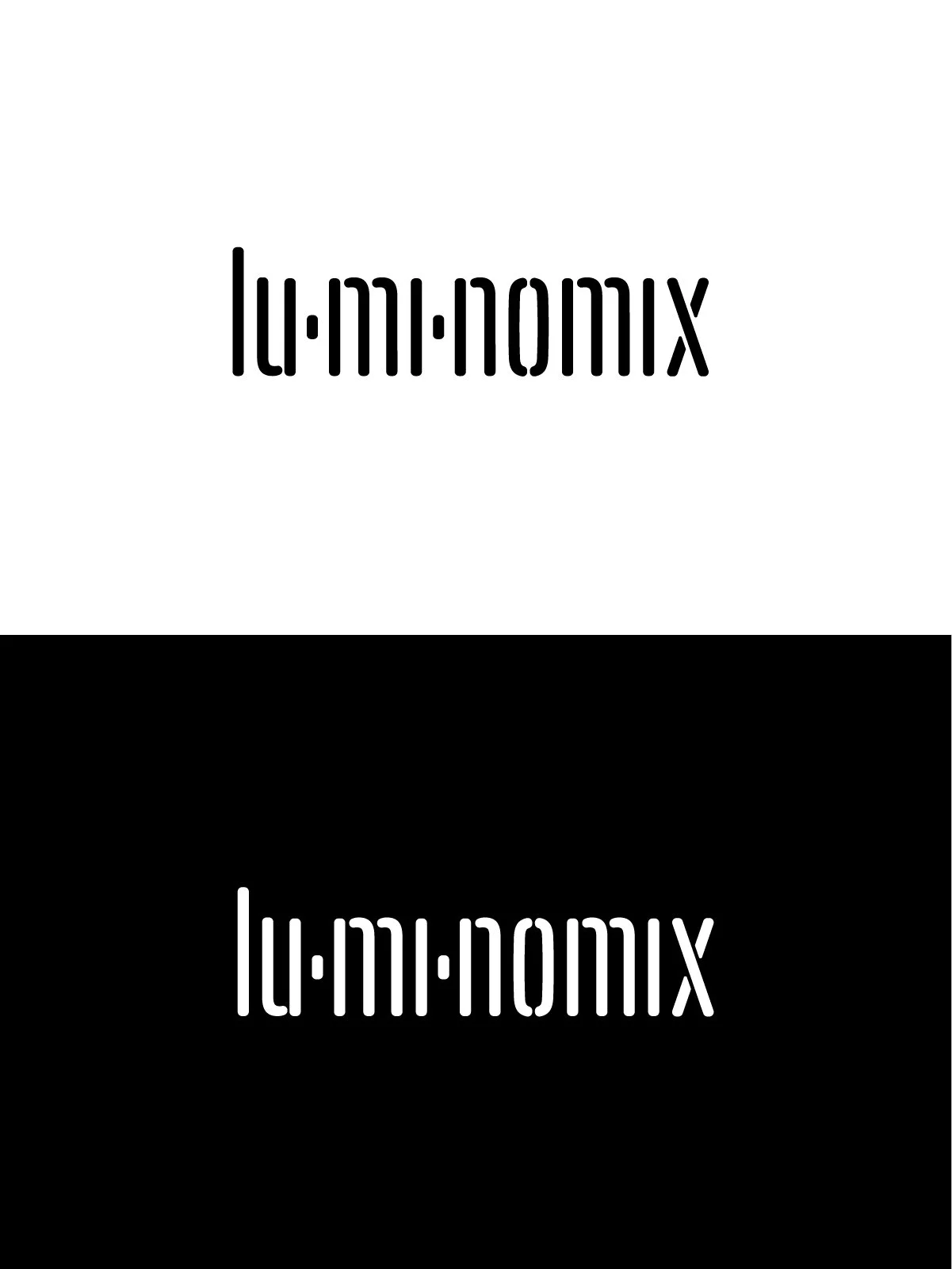
I like this concept for a few reasons. In researching dozens of photography brands, I found so many of them use the aperture that I thought I’d try ditching it. In its absence, the added details of the phonetic separators can really shine.
The stencil cut-out style gives me a film slate vibe. And the tall, condensed letters allow the logo to occupy a more legible and proportional footprint, especially at small scale.
Something about this direction made me envision light shining out from behind the cut-outs, or various elementals.